Auditioning Fabric: Smarter Color Choices for Quilts

Analogous color pulls — like this coral-to-green stack — bring instant harmony to scrappy quilts. Read on to learn how to use them in your own projects.
Over the past five weeks, we’ve been digging through our fabric collections and we’ve:
Sorted our scraps by color families
Analyzed what color palettes we have (or almost have) on hand
Talked about using neutrals
Mapped out strategies for understanding how much fabric we have on hand
Strategized about how to shop smart to fill in the gaps.
This week we’re going to zoom in on the ways you can audition fabrics before you start cutting and how to approach scrap-heavy quilts in particular.
Next week, we’ll tackle how to adjust your color palette on the fly.
Why Audition Fabrics?
Now it is one thing to say “pull a palette from what you’ve got” and another to make it happen. Because fabrics can look great on the bolt next to each other, but once they’re sewn up, once that crisp seam is in place, they can look…blah, like they don’t jive or like they need something else to really shine. This is why auditioning is so valuable — it lets you test before you commit and is a great way to learn how to choose fabric for a quilt with confidence by doing.
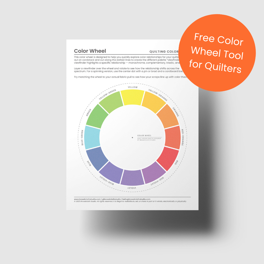
So, grab your handy color wheel (or download the free one below), and let’s take a look at what your project calls for.
Auditioning Before You Start (or Shop!)
One way to approach auditioning is to do as much as you can before you pick up your rotary blade. This step takes a little planning, but it can save you from investing in fabrics that don’t pan out and help you identify gaps and opportunities early.
In order of least to most involved, here are some auditioning ideas to try before you make your next quilt:
Use a coloring sheet: Many patterns include printable or digital coloring pages. Fill one in with pencils, digital tools, or even taped fabric swatches. The one caveat is that colored pencils and even digital swatch cards are only an estimation of what the fabrics will look like in person. Still a great place to start and to test out different color harmonies (and, with digital coloring sheets, an easy way to swap the “role” of your fabrics within the pattern)
Pin fabrics to your design wall. Get away from the neat stack. Lay your fabric out and give yourself room to step back. Walk back and forth, looking at different angles. Change how you’ve laid them out to see what happens when you have less or more of one color. And, as always, take photos!
Mimic proportions: Sew a small checkerboard or stripe set that echoes the proportions of your pattern (say, 60% background, 30% feature, 10% accent). This makes it clear whether your background has enough contrast or your accent really pops.
Sew a test block: If you’re working from a block-based pattern, make a single block with your chosen fabrics (this also works for improv! Just make a couple blocks to start). You’ll instantly see how colors, values, and prints behave once stitched together.
Sometimes with a project, especially when you’re working improv, the project isn’t always fully defined at the start. And it might be hard to work with a coloring sheet or understand your proportions. So my best advice is to start with two colors to get moving as it’ll give you something to react to. And if you accept that changing mid-way is bound to happen, once you’re in the flow and the quilt starts asking for more — more balance, more spark, more breathing room – you’ll be open to the possibility of “yes, and…”.
What about a “Scrappy” Project
Of course, not every quilt begins with a tidy pull from your stash. Sometimes the real goal is to make a dent in your scrap bin, not just with a piece or two, but to really put as many as you can into a single project as possible. How do you audition all of those tiny cuts?
Short answer: I…wouldn’t.
I’d pull them out. And group by color and then organize them by neighbors on the color wheel. And then I’d analyze to see if they’re disparate or cohesive before choosing the best project to work on that.
If they’re a real hodgepodge: the simplest way to bring cohesion is to lean on proportion. Working with a pattern (or an improv concept) where there is a “background” fabric that dominates can make it easy to pull in a wide range of scraps that might not “work” together when it comes to color theory.
If they’re more color-wheel groups: find a pattern with a throughline background color to introduce a neutral to act as a base to build on. With such a pattern, I’d try to stick to colors that are analogous, maybe even push past the traditional “triad” of colors and continue to add different neighbors (and sticking to all warm or all cool tones to help with cohesiveness).
For example, both Supernova Stripes and Constellation Crossing are scrap quilt patterns that give structure while still letting your fabrics shine, but they provide different levels of “support”:
Supernova Stripes works beautifully with disparate WOF scraps, since the background fabric runs between each stripe and provides built-in separation.
Constellation Crossing uses a “through” color that appears in every block. It isn’t dominant in proportion, but it acts as a bridge and allows for more play within the scraps you choose.
So, if you’re trying to use up as many scraps as you can, take a moment to think about your color proportions and how that will affect the sense of “cohesiveness” in the end result. Then try sewing up a couple of test blocks too: even if they don’t work out in the end, you can always use them as reference in your own swatch book down the road.

With Supernova Stripes, the proportion of background fabric and the use of alternating background and accent fabric stripes creates natural cohesion.

Whereas in Constellation Crossing, the background acts as a subtle through line, connecting every block.
Wrapping It Up
Take the time to think about what you want to make, what color possibility the project supports, and then start simple before building outwards. Play, test, make mock-ups. But always bring your hat of possibility with you to observe, analyze, and react.
Auditioning can happen on the fly, before you buy, or even at the very start of choosing your next project. Next week we’ll talk about what to do when a color palette doesn’t pan out and you need to adjust midway through a project. No matter where you are or what you’re making, remember that it all boils down to intention and curiosity.
A Scrappy-Friendly Quilt to Try
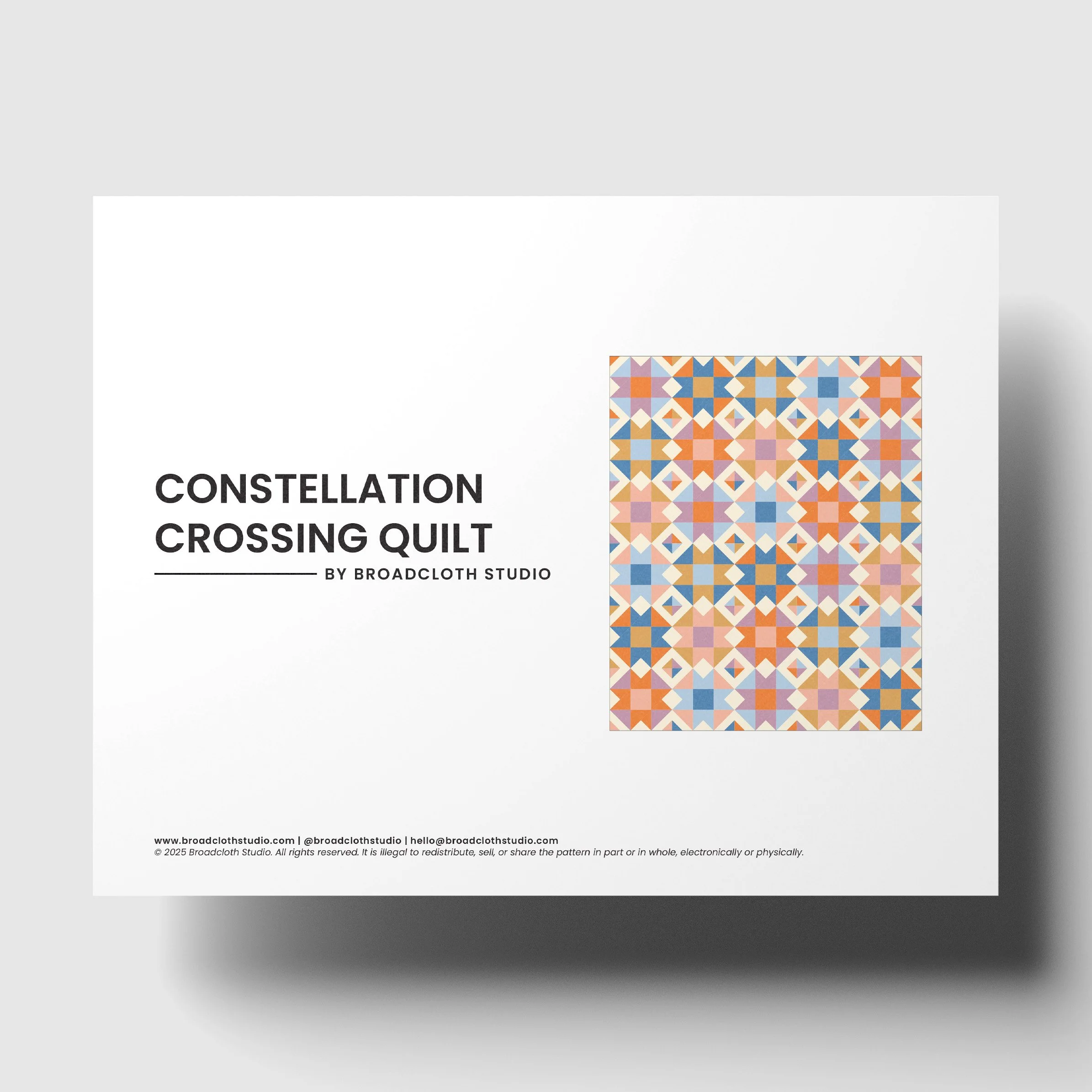
Light up your quilting with Constellation Crossing, a modern take on the timeless Ohio Star block. This pattern keeps things simple with one classic block, repeated for bold, starry impact. By shifting colors across the quilt, each star shines in its own way, creating a glowing lattice of movement and contrast.
Whether you prefer a coordinated yardage pull or a scrappy mix from your stash, Constellation Crossing is designed to fit your style. Go dramatic with a tight color story, playful with a rainbow palette, or thrifty with your scrap bin — the results will be dazzling every time.
Pattern Highlights
A modern celebration of the classic Ohio Star, repeated for graphic, starry impact
Two variations (with full cutting instructions for both): yardage-friendly and fat-quarter friendly scrappy
Expanded Quilt Back Assembly instructions, complete with diagrams
Digital coloring sheets, so you can plan and visualize your quilt before cutting into your fabric
Details
Instant download PDF
Skill level: Advanced Beginner
Standard American terms and measurements
Includes Crib, Throw, and Bed size quilt patterns (fabric requirements can be found here)
© 2025 Broadcloth Studio. All Rights reserved. Resell of finished product with pattern credit allowed.
Light up your quilting with Constellation Crossing, a fresh, modern evolution of the classic Ohio Star. This design layers new elements onto the familiar foundation, creating bold, graphic movement across the quilt. By shifting colors and values, each star glows in its own way, while the layout builds into a striking lattice of contrast and flow.
Whether you work from coordinated yardage, a scrappy fat-quarter pull, or your overflowing stash, this pattern is designed to adapt and to dazzle!
Check it out here.
You May Also Enjoy These Quilting Tips and Guides: