How to Use Neutrals in Quilting for Balance & Flow

The usual suspects: creams, grays, whites. But neutrals can do so much more, keep reading to see how.
In the last couple of posts, we explored scraps and building palettes from what you’ve got. We’ve:
Dug through our scraps and fabric stashes to see what we actually have on hand
Started building palettes from what we’ve got, with a little help from color theory basics
This week we’re focusing on neutrals, but not just as “backgrounds.” Because neutrals can do so much more. They’re not just the backdrop, they’re part of the story and an active part of the palette itself.
Sometimes the most unexpected fabric in your stash can turn out to be the neutral your palette needs most.
What’s a Neutral?

In this sampler quilt from my book Quilting Adventures, neutrals play an active role. White makes up the majority of the palette, giving space for each colorful block to breathe.
Often times, when we think “neutrals” our default mental image is “blacks, whites, creams, and grays.” But that’s just a small slice of the possibility pie!
In color theory, neutrals can encompass:
Achromatic: black, white, gray (no hue at all)
Muted earth tones: beige, taupe, brown
Tints, tones, and shades of colors: desaturated versions of hues (like dusty lavender, muted olive, or smoky blue). They’re still “colors,” but they read quieter because the intensity has been dialed down.
But don’t forget that a fabric’s color role can shift depending on the other fabrics around it. What looks bold in your hand can soften once it’s pieced into a block, or melt into the background when set beside a busier print. That’s where the magic — and the surprise — happens in patchwork.
Pushing Neutrals Further
When you take this expanded definition of neutrals and apply it to your fabric pull, things get interesting fast. Remember: color is relative and a fabric’s role shifts the moment it joins the rest of your palette.
That pale lavender might look vibrant in your stash, but once it’s pieced beside fire-engine red and cobalt, it suddenly behaves like a quiet neutral.
A gray stripe can feel loud on the cutting table, but stitched into a block surrounded by bold florals and solids, it can fade back into the background as subtle texture.
So yes, a fabric can become a neutral depending on its context. What matters most isn’t just the swatch in your hand, but its relative saturation, value, and contrast once it’s pieced into the quilt.
So, What “Counts” as a Neutral?
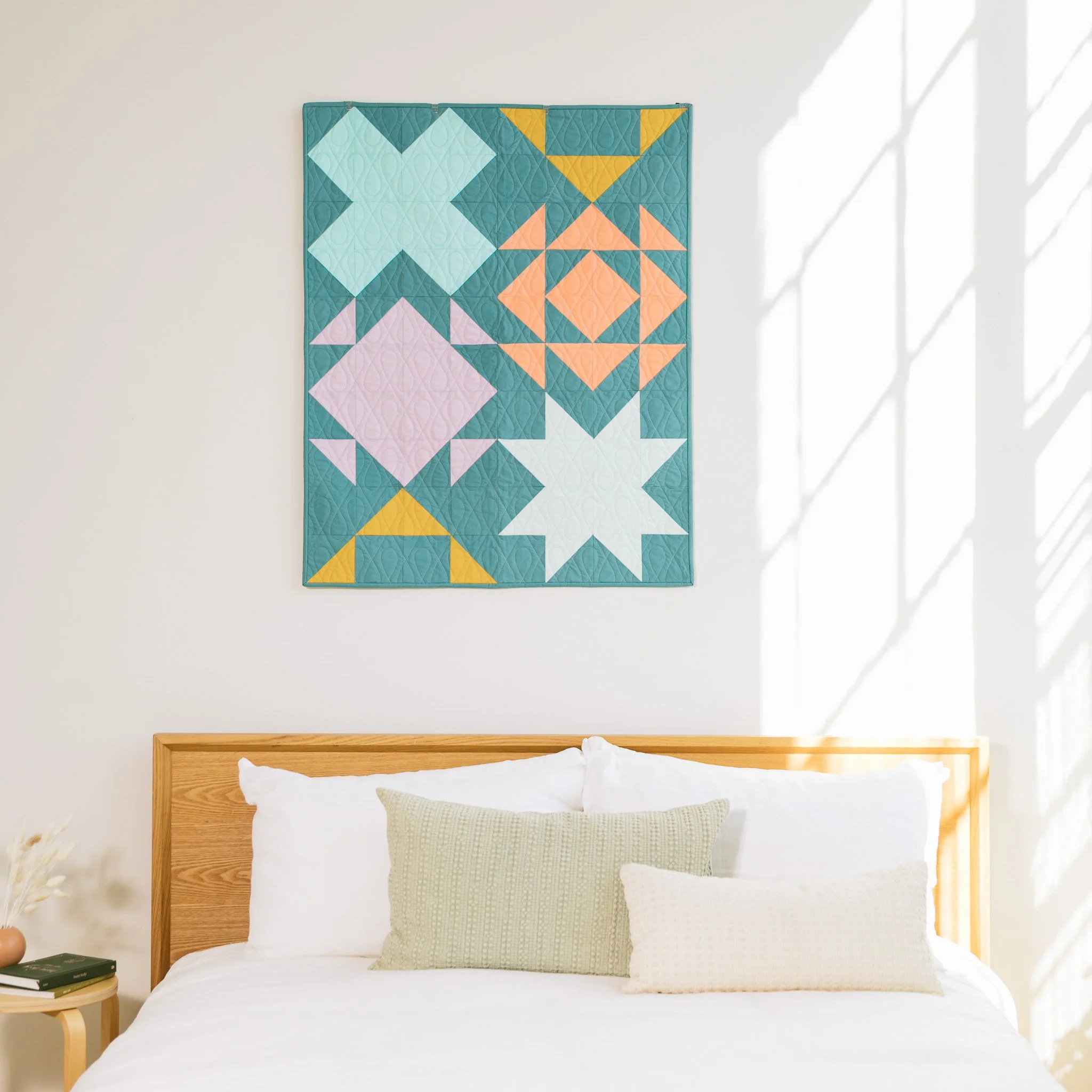
Here, the soft chambray blue acts like neutrals in another quilt from my book, Quilting Adventures. It gives plenty of breathing room while letting pops of pink, gold, and mint shine.
With all this in mind, when we think of neutrals not as a fixed category, but as a spectrum of quiet tones, we expand the possibilities at our fingertips. With this shift in mindset, our definition includes all fabrics that step back instead of shouting for attention:
Classic neutrals: white, ivory, cream, black, charcoal, gray
Earthy neutrals: tans, beiges, taupes, browns (great for organic, grounded feels)
Colorful neutrals: dusty lavender, muted sage, smoky blue and other desaturated hues that feel quiet alongside brights
Patterned neutrals: simple, low-contrast prints like stripes, polka dots, small checks, or tone-on-tones that act like solids from a distance
Remember: colors need context. A fabric might look bold on its own, but when paired with saturated hues, it can behave like a neutral. For example, a gray-and-white stripe may feel “loud” in isolation, but next to a vibrant magenta, it quiets right down and plays a supportive role.
Why Neutrals Are More Than “Background”
Once we’ve got our expanded palette of neutrals at our fingertips, it’s time to challenge the default idea of neutrals as “background” fabric. Sometimes neutrals get treated like empty space, a blank wall for color to hang on. But reimagining them as active players can be a game changer. They can:
Set the stage for bold fabrics, making them look sharper, cleaner, or more vibrant
Control rhythm, guiding where the eye slows down or speeds up across a quilt
Shift the mood entirely — swap a cool gray for a warm cream, and the whole quilt’s atmosphere changes
In quilting, neutrals do more than keep the eye from being overwhelmed. Used with intention, they can push a palette in surprising and powerful directions.
How to Leverage Neutrals in Your Quilts
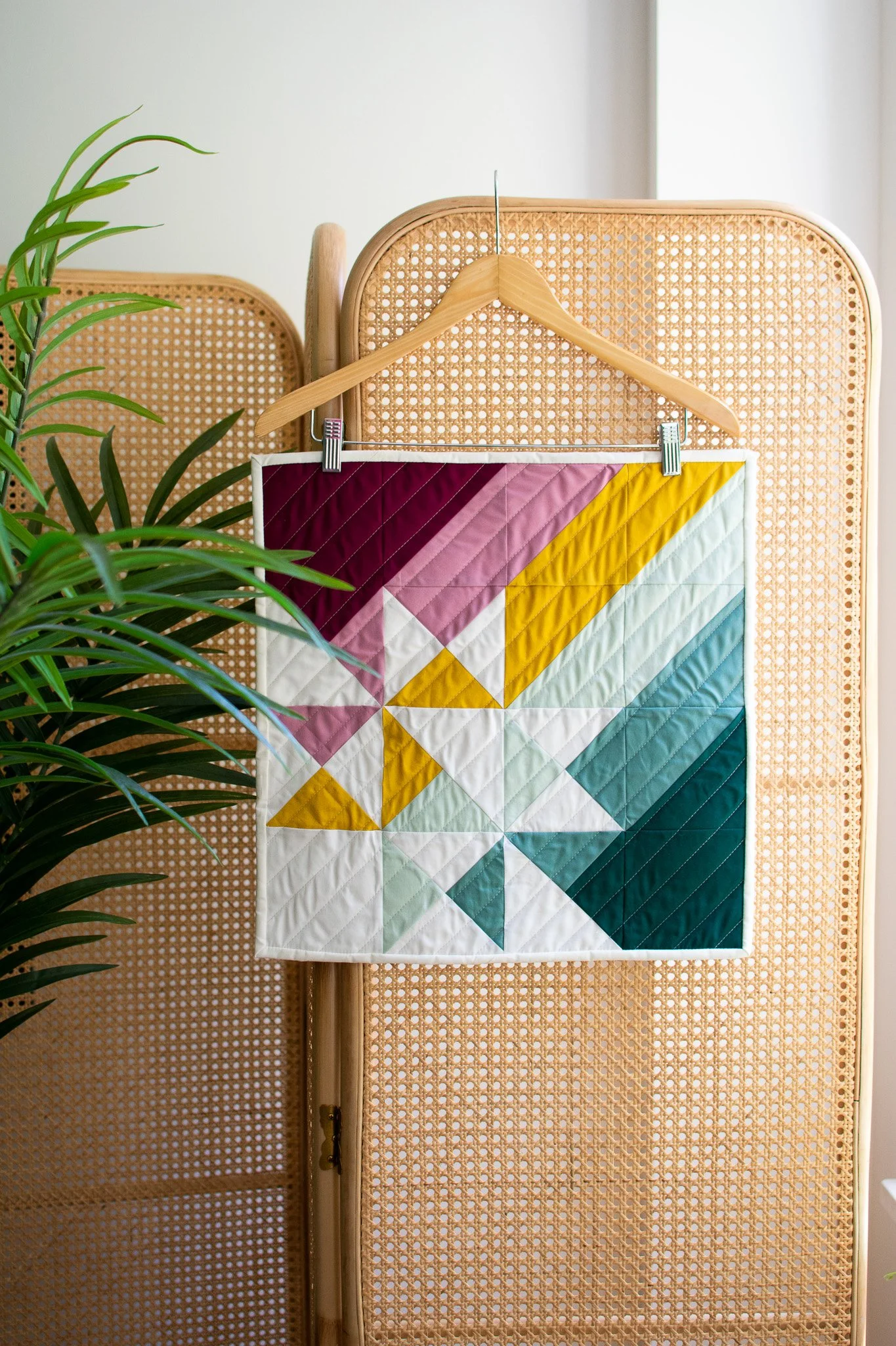
Neutrals can be accents too. That pop of white brings clarity and contrast to a saturated jewel-toned palette in this version of my Anna’s Star Mini Quilt pattern.
So, how can you start to use neutrals beyond just “background” fabrics? Here are three opportunities to use them to shape a quilt: through the proportion you use, where you place them, and how they interact with other fabrics. These principles are especially useful if you’re just learning how to start an improv quilt or experimenting with quilting without a pattern.
Proportion = Mood
How much neutral you use shifts the emotional weight of your quilt:
70–90% neutral: Use a mostly neutral palette for a minimal, calm, modern-feeling quilt. Pops of color feel precious and intentional.
40–60% neutral: Aim for balance and structure. A versatile sweet spot, especially for scrappy improv.
10–30% neutral: Keep the energy bold and saturated. Neutrals act like punctuation, giving just enough pause so the quilt doesn’t feel chaotic.
Placement = Rhythm
Where you put your neutrals is just as important as how much you use them:
Use as a background to make colors and shapes pop
Use as connectors (sashing, recurring strips, shared shapes) to unify a busy quilt
Use as accents to carve out negative space or highlight shifts across shape or line
Use as frames (borders/edges) to calm a quilt and sharpen its focus
Contrast = Storytelling
Neutrals next to brights create drama
Neutrals next to other neutrals create subtlety and texture
Switching from warm to cool neutrals can flip the emotional “lighting” of the quilt (think a warm cream with yellow undertones vs a cool blue white)
Exercise: Play With Proportion
Want to see how shifting proportions changes the mood of your quilt? Cut 2" squares from your palette and piece a simple 5×5 checkerboard block. Play with the mixes above, then sew them into swatches and label each one. Analyze each one and think about how the proportion of neutrals vs colors changes the whole vibe of the block.
Want a shortcut? I created a free Color Palette Proportion Exercise PDF that walks you through this process step by step. Subscribe below to my weekly quilting newsletter to get it (plus a free mini quilt pattern!).

Exercise: Advanced Neutral Play
Take one of the palettes you built last week and test how neutrals can shift its mood and story. Try these three variations:
Layered neutrals — Instead of using just one, combine multiple shades of cream, or mix warm and cool grays. Notice how subtle depth appears without adding extra “color noise.”
Unexpected neutrals — Choose one “quiet” fabric that fits neatly within your palette’s color relationships (for example, a muted sage in a palette full of cool tones). Then try a “quiet” fabric that doesn’t fit at first glance (like a dusty peach in a jewel-toned palette). Notice how each one changes the energy of the palette.
Playing with proportion — Start with a color-forward version of your palette, then shift the ratio: replace a quarter (or even half) of those fabrics with low-value neutrals. Compare the two side by side. Same palette, but the mood and balance transform completely.
Bringing it All Together
The next time you pull fabrics, don’t relegate your neutrals to the background pile. By paying attention to context, proportion, placement, and contrast, you can use them to shape rhythm, create balance, and shift the story your quilt tells. Neutrals can set the mood, change the rhythm, or even surprise you by stepping into the spotlight.
And if you want to see this in action, try making a series of small blocks — like the 5×5 checkerboard swatches from earlier — to watch how these changes play out in real time. Over time, you’ll start to build a reference library of how neutrals can transform a palette, one small block at a time.
Now that we’ve added balance with neutrals, we’ll look at Scrap Support next (aka how to know what you’ve got on hand so you can then shop wisely to fill in the gaps without overwhelming your stash).
Put Your Neutrals to Work
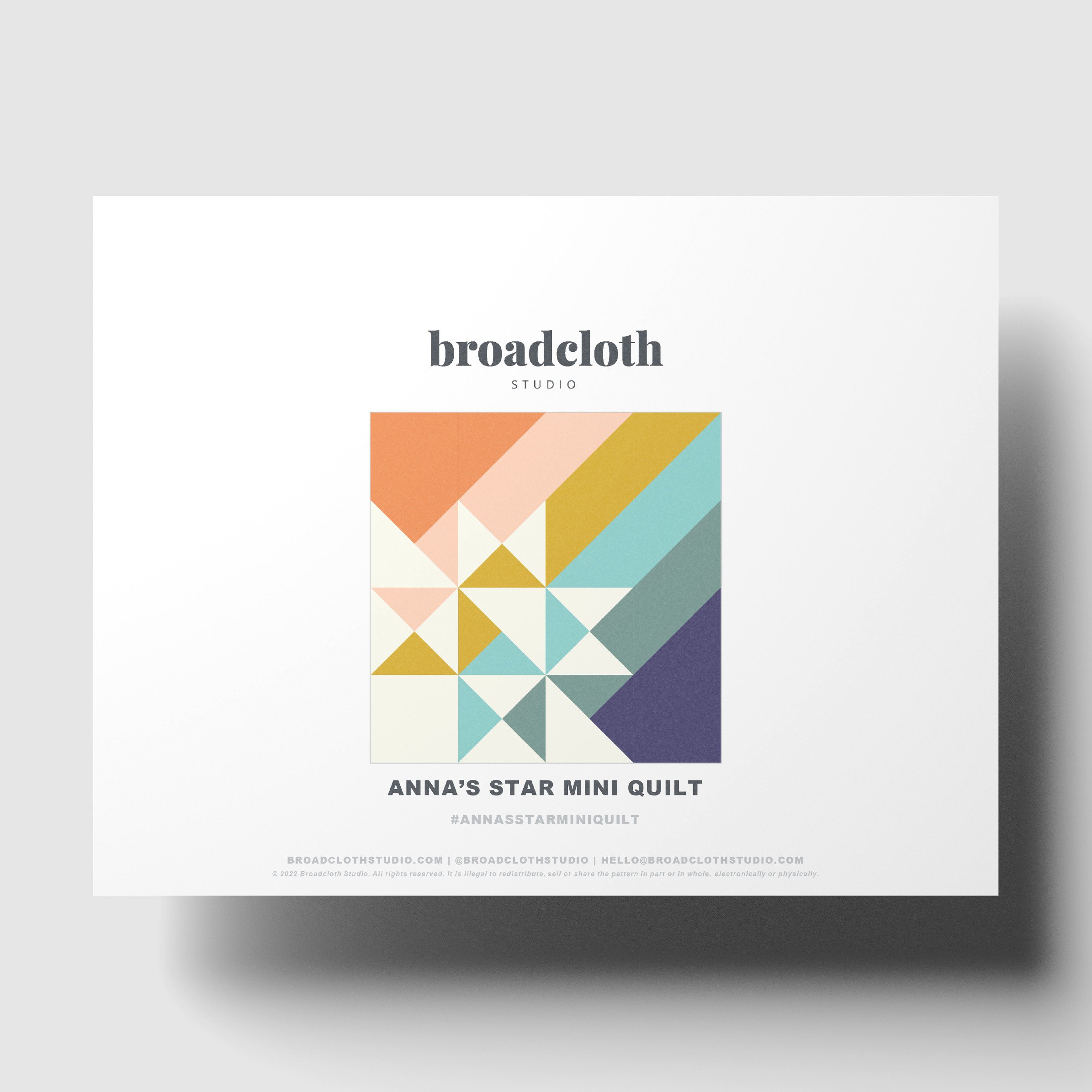
Transform your quilting journey with my innovative take on the classic Massachusetts star block! This unique pattern offsets the traditional star block layout and incorporates playful rainbow stripes, showcasing the creative potential of half square triangles (HSTs) and quarter square triangles (QSTs). Whether you’re a seasoned quilter or trying HSTs and QSTs for the first time, this project is designed for you.
This modern patchwork quilt not only emphasizes a striking star design but also offers endless ideas for vibrant fabric combinations. Perfect as a mini quilt wall hanging, it adds a splash of color and creativity to any room. Dive into this engaging quilt project today and explore the delightful possibilities that await!
• Instant download PDF
• Quilting skill level: Advanced Beginner
• Standard American terms and measurements
• Includes Square Mini size quilt pattern (finished size: 18" x 18")
Resell of finished product with pattern credit allowed.
© 2022 Broadcloth Studio. All Rights reserved.
Neutrals don’t have to fade into the background. They can balance a palette, control rhythm, or even step into the spotlight themselves.
If you want to put these ideas into action, my Anna’s Star quilt pattern is a perfect playground. Depending on how you use neutrals, you can:
Make the star shapes pop with sharp contrast,
Let them blend into the design for a softer, more subtle mood, or
Flip the script and feature neutrals as the stars themselves.
It’s one of my best-selling patterns for good reason: it’s simple to piece, striking to look at, and endlessly versatile for experimenting with proportion and background.
You May Also Enjoy These Quilting Tips and Guides: