From Chaos to Color Palette: Choosing Fabric for Your Next Quilt

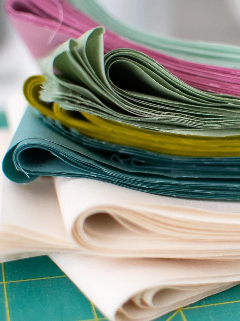
In a perfect world, all our fabric stacks would look like this — crisp corners, perfectly folded, every color in its place…
If you’ve taken the time to sort your fabric scraps by color (see last week’s post on how to organize fabric scraps for quilting), you’re already ahead of the game.
Now it’s time to take the next step: pulling together a palette that works, whether you’re quilting with a pattern or playing freely with modern improv quilting.
This guide will walk you through how to move from sorted scraps to a usable fabric pull, including how to assess what you have, explore color relationships, and decide what (if anything) you need to add. These same steps work whether you’re following a pattern or building your own quilt layout ideas from scratch.
Everything is Organized. What Now?
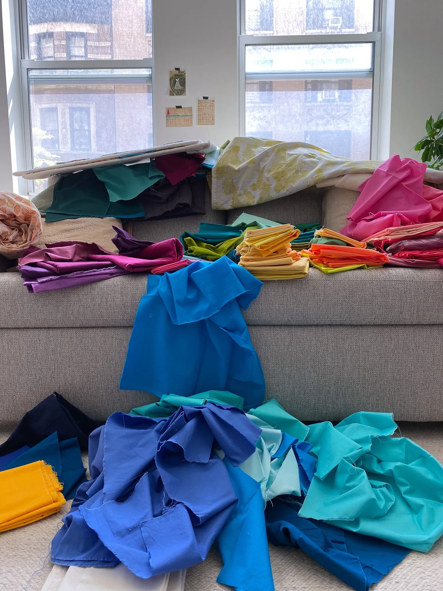
…but honestly? Most of the time, reality often looks a lot more like this (at least mine does!).
At this point, there are a few ways you might move forward.
Maybe you don’t have a pattern in mind yet or are starting an improv quilting project. In that case, now is a great time to explore color relationships and play with how your fabrics interact.
Or maybe you do have a pattern picked out. Then it’s time to start thinking about how much fabric you’ll need, and which of your scraps are actually usable for the project.
For example, a pattern like Supernova Stripes works best with full width-of-fabric (WOF) cuts. Smaller odds and ends won’t work for the main blocks in this design, but they might be perfect for a block-based pattern that calls for smaller pieces or as part of a scrappy quilt back.
Take a minute to think about what your next project needs, or maybe you just want to keep playing with fabric and color for the sheer fun of it. Remember, “playing” is every bit as worthwhile as working toward a specific quilt. Whether you’re exploring color palettes or diving into a project, you’re still making something wonderful happen.
Understand Your Yardage Needs (and Combine What You Can)
These width of fabric cuts would be perfect for a pattern like Supernova Stripes!
If you’re working on an improv piece with no set size or layout, you can more or less dive right in and start building (see more on estimating fabric yardage for an improv quilt below). But if you're following a pattern, it’s worth thinking through the logistics before you commit.
The key question is: do you have enough of your chosen fabrics, in the right sizes, to meet the project’s needs?
Start by reviewing the pattern. Some designs call for strip piecing or larger cuts, which can be harder to manage with small scraps. Others are more flexible.
For example: Supernova Stripes relies on long WOF strips. If you were going to make it, I would start by pulling only your WOF cuts and keeping them in color order. Then setting the rest aside for now.
On the other hand: a pattern like Sonnets uses quarter-yard cuts and various shapes, so it allows more flexibility. You may even be able to patch smaller pieces together as you go.
Don’t stress about having the perfect amount of fabric yet. Focus on your color palette first. Once you know what’s in the running, you can see whether anything needs supplementing.
If you’re someone who likes more structure, try sketching the cutting instructions on paper. You can even cut out shapes and use them as stand-ins to test against your fabric — a great trick for block-based quilt layout ideas.
Explore Color Relationships with Adobe Color
Once you’ve narrowed down your options, it’s time to play.
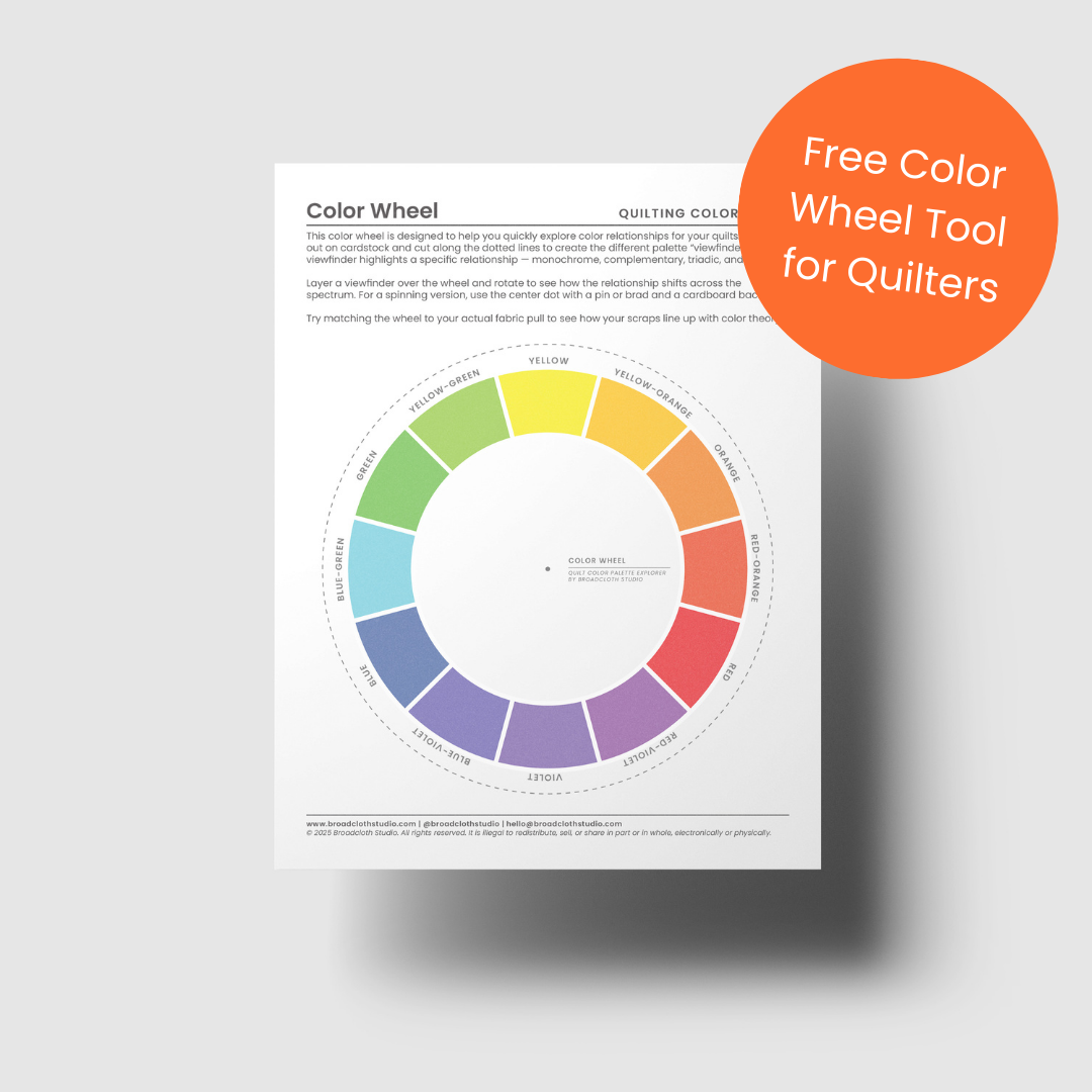
One of my favorite tools is Adobe Color, which lets you build palettes from scratch or upload a photo of your fabrics to explore different color relationships. Or if you’d like something you can hold in your hands, download my free Quilt Color Wheel PDF below. It comes with relationship-specific “viewfinders” you can place right over the wheel to quickly see analogous, complementary, triadic, and more. It’s a simple way to train your eye while you play with your fabrics.
Try experimenting with:
Monochromatic — one color with its tints, tones, and shades
Analogous — colors next to each other, soft and harmonious
Complementary — opposite colors, bold and high contrast
Split complementary — one color and the neighbors of its complementary opposite
Triadic — three evenly spaced hues, playful and balanced
You don’t have to use every scrap. Choose the ones that play well together, not just the ones you feel obligated to include.
Don’t know where to start? Try this: pick one color you love from your fabric sort and use it as a base. Pull a few color families that relate to it and move them to the center of your workspace. Take a photo, then put them back and try a different set. Repeat until something clicks.
You can even sew a few test pieces together and finger press them (no need to iron and crease the fabric). Seeing how fabrics interact at the seam can shift how they feel in the palette. And if you change your mind or decide the fabric pairing isn’t quite jiving you can always unpick it!
This is where exploration starts to become intention. You’re not locking anything in yet, but you’re starting to see which fabrics belong together — and which ones you want to keep reaching for.

Analogous Colors

Complementary Colors

Split Complementary

Triadic Colors
A Quick Note About Value and Scale

Switching to greyscale is a quick and easy way to check value: you might have plenty of colors, but not enough contrast between them!
If you’re feeling confident about your palette, you might also start noticing differences in value (light vs. dark). A balanced mix of values can help bring cohesion and contrast to your improv quilt layout. But balance isn’t the only option. Sometimes, leaning into an unbalanced mix can create a beautiful, distinctive mood (the Impressionists often leaned into value imbalance, filling most of the canvas with light or mid-tones and using just a touch of dark (or light) for emphasis).
You don’t need to go deep here. Simply organizing your fabrics into light, medium, and dark can help you visualize how your quilt might take shape, and the easiest way to check value is to take a quick photo on your phone and switch it to greyscale. It strips away color so you can instantly see the light/dark balance (or intentional imbalance) in your palette.
Do You Have Enough Fabric?

Sometimes for an improv project (or any quilt, really), laying everything out is the quickest way to see how much surface area your scraps actually cover. It’s instant insight into what you’ve got and what you might be missing.
If you’ve found a fabric pull you love and you’re using a pattern, now’s a good time to pause and make sure you have enough.
Try one or two of these low-pressure strategies:
Lay your fabrics out on the floor in color groups to see how far each one might stretch
Sketch out the cutting instructions from your pattern and compare to what you’ve pulled
Mock up the pieces with scrap paper and test against your fabric
Group your scraps by yardage equivalents — for example, can three fat quarters replace a full yard?
For improv quilts, the math is looser. A good rule of thumb is to aim for about 1.5 to 2 times more fabric than your intended quilt size. That gives you flexibility to trim, revise, and adjust as you go.
This isn’t about perfection, it’s about giving yourself the confidence to move forward or spotting the gaps before you cut.
What Comes Next?
What if you don’t have enough fabric for your project? Or if the scraps you have aren’t quite working the way you hoped?
That depends on where you are in the process.
If your palette feels too bold, too busy, or like something’s missing, next week’s post will walk you through how to bring in neutrals to calm things down or tie everything together.
If you’re missing a key color or want to expand your palette, we’ll cover how to audit your fabric collection to know what you have and what you’re missing before talking about how to shop wisely for fabric, with tips for filling the gaps without overbuying.
Wherever you land, you’ve already taken the most important step: getting to know your fabric and building a palette that starts with what you have. Keep your scraps organized by color family so it’s easy to pull from in the future. And if it helps, you can group them further by size — small scraps versus yardage — but always keep color front and center.
Looking for a fun project to play with your colors?

Let each row set the rhythm.
Rhythm & Rows is all about flow. This horizontal improv framework helps you create balance, movement, and variation—one row at a time. It’s ideal for quilters who love exploring subtle shifts and strong motifs within a clean, linear layout.
Whether you’re aiming for calm and cohesive or bold and graphic, this playbook gives you the rhythm to improvise with intention.
Why You'll Love It
A row-by-row approach: Focus on one visual idea at a time, then let your quilt build organically
Prompts for flow and repetition: Learn how to develop rhythm and variation across rows
Flexible row formats:Use sketching prompts to experiment with layout flow and block variation
Build with clarity: Freehand cutting video demos support your construction every step of the way
Details
Instant download PDF
Skill level: Advanced Beginner to Easy Intermediate
Standard American terms and measurements
Includes access to companion video tutorials
Includes three layout options for a Throw Sized quilt (54” x 60”)
© 2025 Broadcloth Studio. All Rights reserved. Resell of finished product with pattern credit allowed.
If you’re ready to put your new scrappy color palette to work, the Rhythm & Rows Playbook is a great place to start.
Its row-based structure is supportive and straightforward, allowing for plenty of creative color-palette freedom while keeping you from getting stuck.
You can make classic stripes or work with triangles, curves, L-shapes — whatever shapes you love — and still have a framework that lets the creativity of your color choices shine through. It’s an adaptable, playful way to keep exploring your palette and turn your fabric pull into something beautiful.
If that sounds like fun, check out Rhythm & Rows today!
You May Also Enjoy These Quilting Tips and Guides: