A Fabric Framework for Scrappy Sewing
Keeping the background uniform brings a sense of unity to a scrappy quilt (as in this scrappy version of my Flight Formation pattern).
When it comes to scrappy sewing, one tool to have in your toolkit is understanding fabric roles — the ‘jobs’ each fabric plays in a quilt pattern, and how this framework makes scrappy projects feel less overwhelming.
Think about fabric roles as a framework that’ll help you make sense of your scraps, your colors, and your pattern. It’ll help you avoid decision fatigue by making it clearer what your options are and what options you can quickly rule out — like knowing your background works best in a single consistent color, not a jumble of jewel tones..
Why Do We Need a Framework?
When it comes to diving into a scrappy quilt, there are so many different options at your fingertips and decisions to be made that don’t come with sewing from yardage.
You’ve got the logistical ones: how many scraps do you have on hand? How are you going to cut them? Will you have enough fabric to get all your pieces?
And then there are the design-centric questions: how many scraps will you be using? How many colors? These are the ones that personally trip me up the most! I get hung up on whether that scrappy look will turn out too chaotic for my taste…and once I start worrying about that, I get tempted to scamper back to working with yardage so I can be in full control of the end result.
But I almost always regret not at least trying the scrappy approach.
This is where the framework comes into play: once you start looking at quilts through the lens of roles instead of fabric counts, the scrappy possibilities really open up and it makes it easier to see what decisions you need to make. That’s because fabric roles are tied to the structure of the quilt pattern’s design — they reflect how the fabrics are distributed across blocks and the overall layout.
What Are Fabric Roles?
When I say “Fabric Roles” I’m really talking about what job or purpose each color plays within the design of a quilt. So, instead of thinking in terms of “Fabric A, Fabric B, Fabric C,” we’re going to think in terms of design function:
Background: this is the stage that sets off the rest of the design. It often uses the largest amount of fabric and is a through-line across the pattern, often like the “setting” for the other shapes that make up the pattern. In other words, the background fabric is baked into the structure of the design — it shows up everywhere, so it has the most influence on how the quilt holds together
Main: this is the anchor of the design elements and there may be two or three of these, but there’s almost an order of hierarchy where one is the primary, one secondary, then tertiary etc. An easy judge of this is the amount of surface area each takes up (for example, one fabric might dominate the star points, while another only shows up in the corners).
Accent or Contrast: these often call for the smallest amount of fabric, they add a little special sparkle or a pop of contrast that draws the eye.
An odd analogy, but one that I’ve found helpful, is soup. Think of a bowl of chicken soup and the proportions of each ingredient that shows up in a bowl. You’ve got your broth (the background), your chicken (the main character), your noodles (a secondary main character), then your veggies like celery and onions (a tertiary main character), then you’ve got some carrots sprinkled in (as your accent), and maybe it’s topped off with some herbs (an even smaller pop of contrast).
Every quilt might have as many “ingredients” as the chicken soup example, sometimes the background and main are the same fabric — like in a wholecloth quilt or a super-minimal hourglass quilt— which is more like tomato soup with crackers sprinkled on top.
Just like in a recipe, each quilt is made up of a variety of ingredients. Not all ingredients are always going to be used in equal proportions, instead they’ll be used as needed to make the dish (the quilt) shine.
How to Read a Pattern for Roles
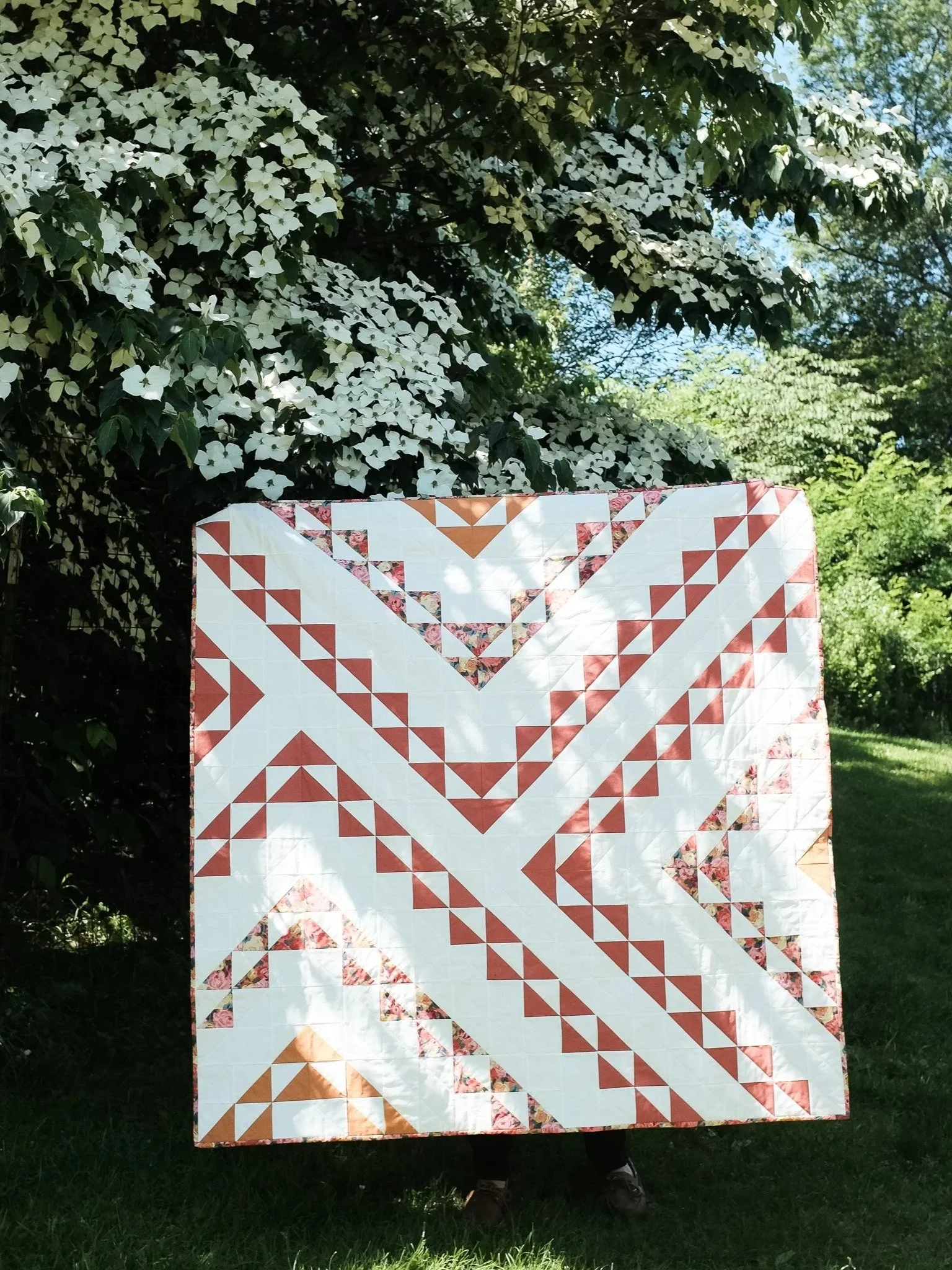
My Flight Formation pattern is a great example of a clear “Background”, with two "Main Fabrics” (in this sample, the solid terracotta is the primary, and the rose print here is the secondary), and the gold is an accent.
Now that you’re thinking in terms of roles, it’s time to take a good look at the pattern you want to make and ask yourself some questions.
I’d start by looking at a mock-up illustration or photo, keeping the fabric requirements handy so you can check your visual analysis against the math:
Which fabric has the largest yardage requirement? → Likely the background.
Which fabrics are used across many blocks? → Likely the main role(s).
Of the fabrics used across many blocks, what are the proportions of each within the blocks and across the blocks? → Use this to order the main roles (for instance, if one fabric covers most of the block center and another only frames the edges, you’d call the center fabric the primary main and the frame fabric a secondary main). This step ties the roles directly to the quilt’s structure: the more surface area a fabric covers in the block or layout, the more it shapes the design’s overall look.
Which fabrics are small yardage or used for highlights? → Likely accents.
How to Make Design Decisions
Once you understand the breakdown of roles within a design, look at the bones of the pattern and ask: Where does the design need stability, and where can it handle variety?
Background → Because it runs throughout the whole quilt, the background usually does best when it’s more consistent and can act as an anchor. It’s the structural foundation — like the walls in a house — so keeping it steady often helps the rest of the fabrics shine. A single fabric keeps things grounded and gives the eye a place to rest, which can be especially important when dealing with a wide array of scraps in your main fabrics. That said, if your pattern has lots of open space, a scrappy low-volume mix (whites, creams, subtle prints) can add texture without throwing the design off balance.
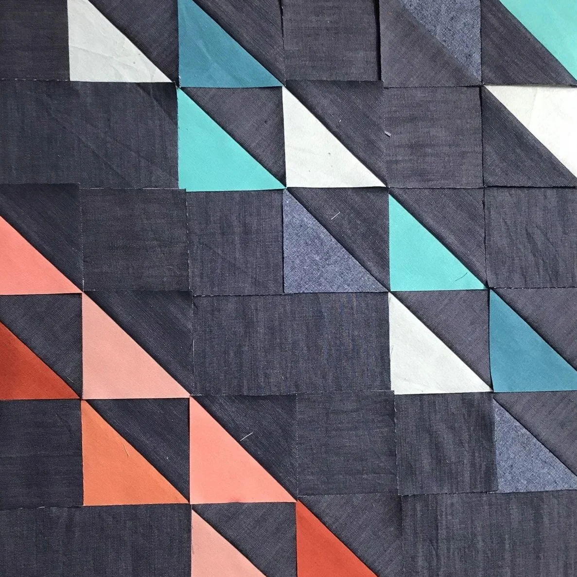
Main fabrics → If you’re working with a repeating block pattern the block layout itself keeps things orderly, which means you can let your scraps play around across your blocks (but keep them more structured within the block with a tighter color-family — say, all blues in one block, or all pinks together). That’s where you’ll get rhythm, movement, and that signature scrappy feel.
Accents/Contrast → Since they pop up more sparingly across the design, accents can provide you with the most wiggle room. A single fabric creates a reliable “pop,” while scrappy accents scatter little sparks of surprise around the quilt. If you keep the color-family story tight within each of the other fabric roles (like all neutrals in the background and monochrome tones in the main — then you can go bold and varied with accents), you can really push the limits here.
So instead of thinking about scrappy vs. consistent as a style gamble, tie your choices back to the structure of the design. You’re not fighting the pattern—you’re using its structure to guide you, adjusting the level of scrappiness while keeping the full picture in mind.
And if you’re not sure how far you can push it, grab a coloring sheet. Seeing a scrappy mix mapped onto the layout (digital or analog) makes it so much easier to tell where you can let loose and where you might want to hold steady.
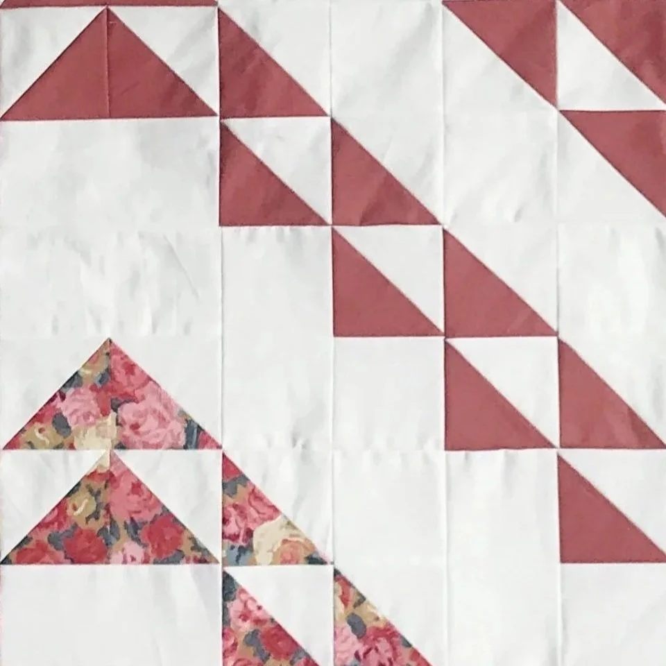
All the lines of HSTs in my Flight Formation quilt are just perfect for the scrappy treatment…
…and by keeping the background fabric constant, the scraps really take center stage!
Why This Matters
Remember that moment of overwhelm when you first look at a pile of scraps? When you feel that sneaking in, remember that you’ve got a roadmap for how to move past that overwhelm.
Fabric roles give you a step-by-step approach to understand the design of the pattern: you know where stability matters, and where you can cut loose. Suddenly that “what if it’s too chaotic?” voice gets quieter — because you’re not winging it, you’re designing with intention.
And the best part is that once you start analyzing and seeing quilts this way, almost any pattern becomes an invitation to go scrappy. That “four fabric” quilt? It’s really just a background, a main, and a couple of accents. That’s not chaos, that’s freedom.
Looking Ahead
Now that you can identify fabric roles in patterns, the next step is answering the big question: “How much fabric do I actually need if I’m using scraps?” In next week’s post, we’ll talk about translating yardage into scrap-friendly equivalents and share a few handy conversion tips.
Put the Framework into Practice!
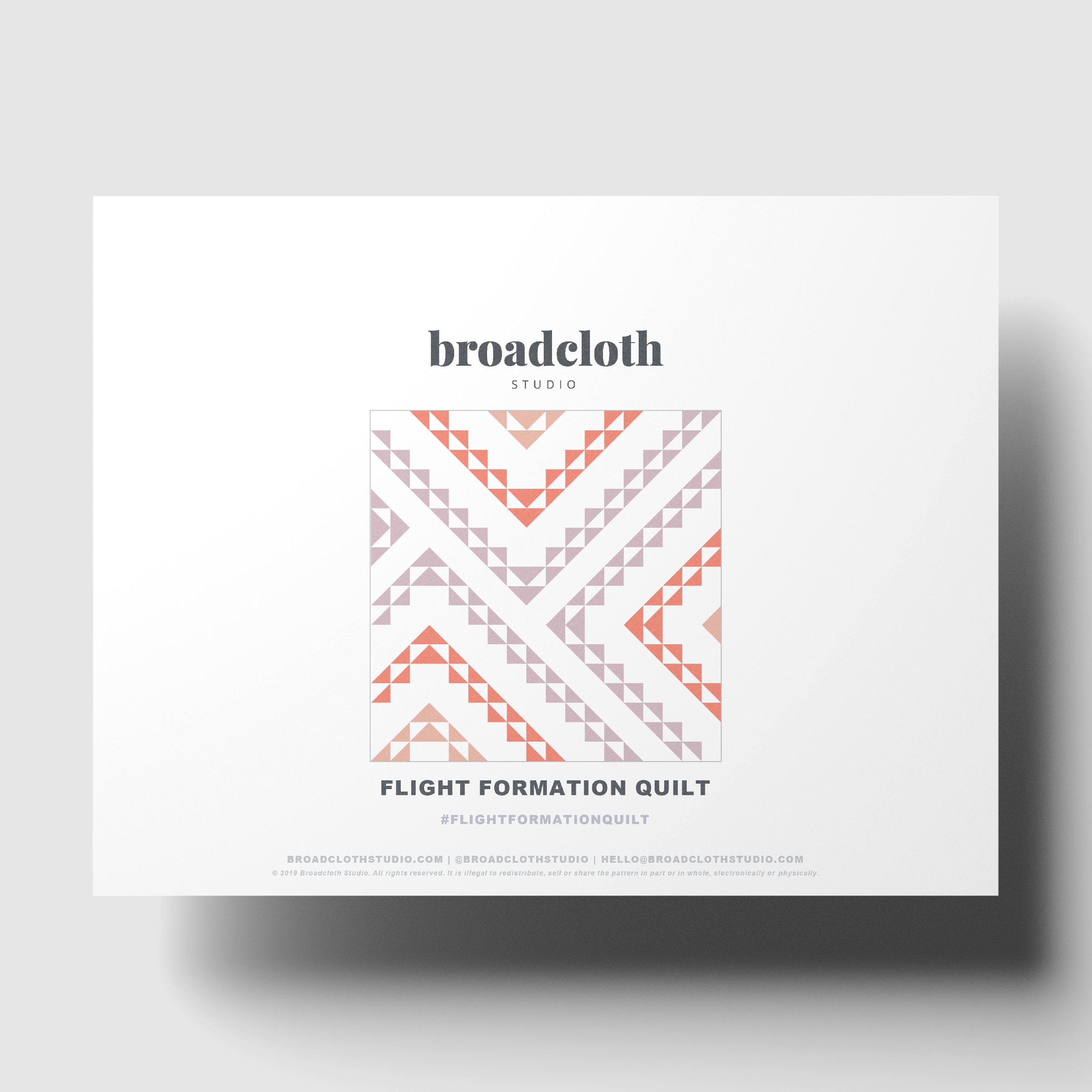
The Flight Formation Quilt Pattern brings a fresh, modern design to your next quilting project, featuring dynamic formations of half square triangles. This striking geometric quilt is made entirely from simple triangles, making it an easy yet unique patchwork project for quilters of all levels. With its bold diagonal layout, this pattern creates a sense of movement and direction, perfect for those seeking quilt design ideas with visual impact.
Whether you’re choosing vibrant colors or sticking to a classic palette, the pattern is flexible enough for you to customize and make your own. Dive into this modern quilt pattern and explore the endless possibilities of working with half square triangles.
• Instant download PDF
• Quilting skill level: Advanced Beginner
• Standard American terms and measurements
• Includes Crib, Square + Rectangle Throw, Twin, Full/Queen, and King size quilt patterns
Resell of finished product with pattern credit allowed.
© 2019 Broadcloth Studio. All Rights reserved.
The quilt in these photos is my Flight Formation Quilt Pattern — a bold, modern design built entirely from half square triangles. With its striking diagonal layout and crisp, consistent background fabric, the design really lets your main and accent fabrics shine.
It’s the perfect playground for experimenting with fabric roles: keep the background steady to ground the quilt, let your main fabrics create movement, and sprinkle in accents for sparkle.
Whether you go scrappy or stick to a tighter palette, Flight Formation adapts beautifully — fresh, graphic, and uniquely yours.
Check the pattern out here.
You May Also Enjoy These Quilting Tips and Guides: