Sort Your Scraps by Color: A Smart First Step for Improv Quilting
Laying out your fabric scraps in color groups helps you spot gaps, outliers, and exciting color relationships. It’s also a great exercise to help train your eye!
Leftover fabric — whether width-of-fabric cuts or odd-sized scraps — is both a gift and a challenge.
Whether you’re working with a pattern like Supernova Stripes or starting your next modern improv quilt, using what you already have — partial yardage, fat quarters, binding strips, or trimming piles — can be creatively exciting and a little overwhelming. Too many prints, not enough yardage, and the nagging feeling that nothing quite “goes together” can stop you before you start.
Let’s simplify that.
For the purpose of this post, I’m calling all of that — your leftover yardage, binding offcuts, odd cuts, and nearly-forgotten favorites — your scraps. It doesn’t matter if they came from past quilts, mystery boxes, or untouched fat quarters. The point isn’t to limit your materials. It’s to start from possibility, not pressure.
You also don’t need to have a specific pattern in mind to do this. Sorting your scraps by color is a powerful creative warm-up and a great way to start thinking about your next quilt layout or improvisational project without the pressure to commit.
You don’t need a perfect plan. You just need a smart place to begin. That’s where color theory comes in — not the rigid, textbook kind, but a playful, intuitive approach that helps you see potential in what you already have.
Today, we’ll start with a simple but powerful process: sorting your fabrics by color, observing what you’ve got, and setting yourself up for color play next.
Sort What You Have by Color Family
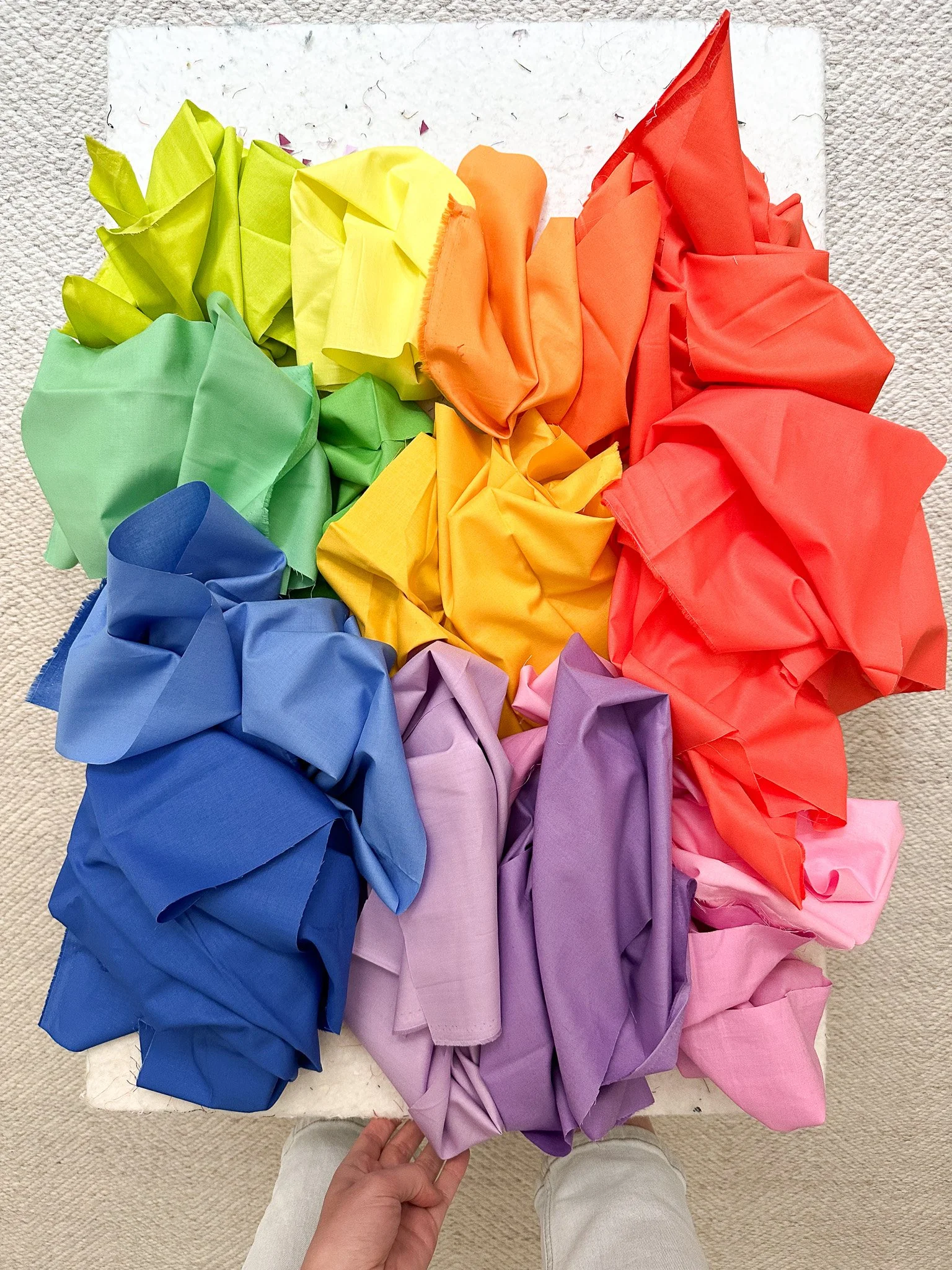
Start by grouping your fabrics into loose color families: reds, oranges, yellows, greens, blues, and purples. The rest (whites, blacks, browns, and grays) you can set aside for now.
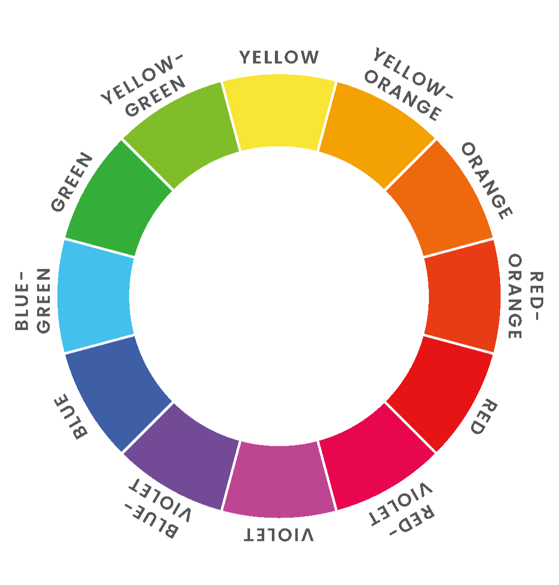
Once you’ve sorted them by major color family, take a closer look and start teasing out the tertiary colors. These are the the in-between hues that sit between the primaries and secondaries, like red-oranges, yellow-greens, and blue-violets.
You don’t have to be exact. Just trust your eye. If a fabric reads blue, keep it in the blue pile. If it blends two colors, like blue and green, let your gut guide you as to which bucket it’s more aligned with.
If you’re not sure where something belongs, try the buddy system. Hold it next to two clear examples — maybe one that’s definitely blue and one that’s definitely green — and see which it feels closer to.
It can also help to do a quick sort first and refine later. Some fabrics only make sense once you see the full spread. And if you have a color family with lots of options — like blue — it’s a great place to start training your eye. You might notice some fabrics lean more teal (blue-green) while others have a hint of purple (blue-violet). Lay them out and observe the shifts.
The goal isn’t perfection. It’s about noticing how color behaves — and how you respond to it.
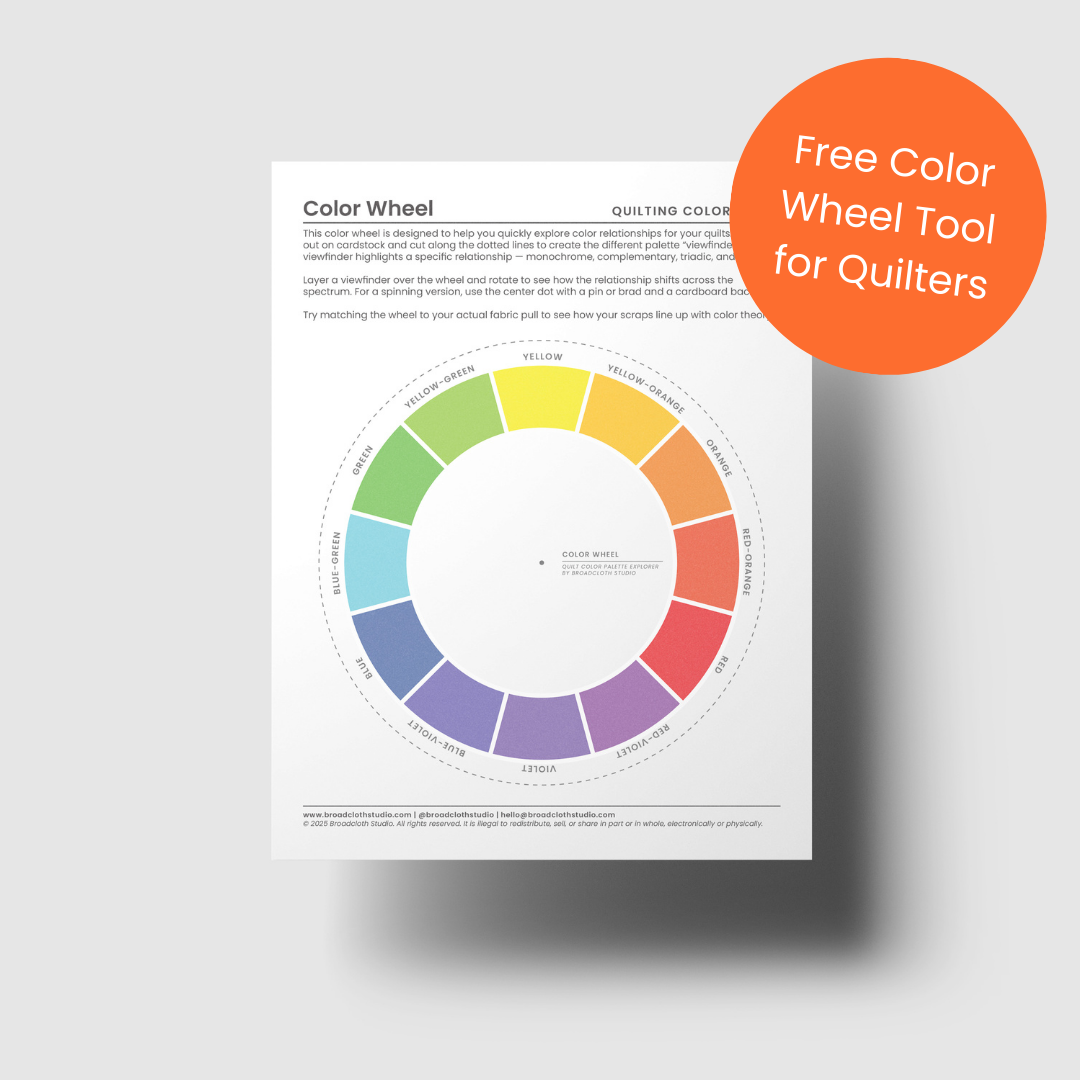
And if you’d like a simple visual guide while you sort, don’t worry if you don’t have a color wheel handy! You can download my free Quilt Color Wheel PDF below to help you spot relationships and build confidence in your pulls.
Organize for Future Pulls

Your fabric storage doesn’t need to be perfect (mine certainly isn’t!). Just aim for a loose color-based system that works for your space and makes it easier to see what you have. It’ll get messy, but that’s part of the process.
Bonus tip: Keep your fabric organized by color going forward. Small boxes (old shoe boxes work great) or drawer dividers can help you keep everything grouped and visible.
If you can, try to arrange the colors in a circle or line to mimic a color wheel. This helps you spot outliers or subtle shifts. The classic order goes: Red, Red-Orange, Orange, Yellow-Orange, Yellow, Yellow-Green, Green, Blue-Green, Blue, Blue-Violet, Violet, Red-Violet, followed by neutrals.
Personally, I like to keep neutrals in a separate section — whites, creams, grays, browns, and blacks — so they don’t distract me while I’m building a color-forward palette.
(Psst — this post is packed with ideas on neutrals. Pin or bookmark it so you don’t lose it!)
Up Next…
Now that you’ve sorted your fabrics and started noticing how they relate to one another, you’re ready to start building a fabric pull that suits whatever kind of quilt you’re planning next, whether that’s quilting without a pattern or preparing for something more structured.
In the next post, From Chaos to Color Palette: Choosing Fabric for Your Next Quilt, we’ll explore how to:
Define your fabric needs (whether you’re working on a pattern or starting a new improv project)
Estimate whether you have enough usable fabric
Experiment with color combinations using Adobe Color
And begin narrowing in on a palette that feels both intentional and exciting
By sorting and noticing your scraps, you’ve already set your creative wheels in motion and we’ll take that momentum into color play.
Have Lots of Odds & Ends WOF Strips?

Big, bold, and made to impress, Supernova Stripes takes the classic sawtooth star to a whole new scale. With nothing more complicated than clever strip piecing and a few oversized cuts, you can create a striking quilt that sews up quickly and looks spectacular. Choose from two included variations, the textured Splintered Star or the crisp, high contrast Distinct Star, and make it your own with solids, prints, or even scraps.
Pattern Highlights
Two striking variations: Splintered Star (mix background into the star for texture) or Distinct Star (keep background separate for strong contrast)
Instructions for Crib, Throw, and Bed sizes
Detailed cutting charts and step by step diagrams for every size and variation
Three short demo videos covering key steps
Digital coloring sheets via PreQuilt to test color combinations before you cut
Pattern Details
Instant download PDF
Quilting skill level: Easy Intermediate
Standard American terms and measurements
Includes Crib (36” x 40”), Throw size (56" x 62"), and Bed size (90” x 96”) quilt patterns (fabric requirements can be found here).
© 2025 Broadcloth Studio. All Rights reserved. Resell of finished product with pattern credit allowed.
Supernova Stripes is a go-to pattern for modern quilters ready to put leftover width-of-fabric strips to good use. Whether they’re extra binding pieces or yardage from past projects, this quilt turns your stash into something bold and eye-catching.
This scrappy patchwork design transforms mismatched strips into a quilt that feels dynamic and personal. You can pair your accent fabrics with a consistent background for a clean, graphic look, or skip the background entirely for full-on scrappy energy. Either way, you’ll end up with a modern, one-of-a-kind quilt that tells your fabric’s story.
Whether you’re planning your next project or just want to make a dent in your scrap bin, Supernova Stripes is a fun, flexible choice.
You May Also Enjoy These Quilting Tips and Guides: