Choosing Fabric for Improv Quilts: Start Simple, Stay Inspired

So many colors…but which to choose?!??
Color can be one of the most fun parts of quilting. It can also be one of the most overwhelming.
Going to the quilt shop, pulling fabric, looking at all the gorgeous prints and colors? Total rush.
Maybe it’s just me, but sometimes, once I’m back in the studio and actually sewing with what I picked, things don’t quite come together the way I imagined.
With modern quilt patterns or traditional blocks, there’s a little more room to plan ahead. I love including coloring sheets with my patterns (both print and digital when I can) so folks can test out color combinations before buying fabric or cutting into anything.
But when it comes to improv quilting, it’s a bit trickier. You might have a loose idea, but since you're making design decisions on the fly, it can be hard—and often intimidating—to figure out what you need before you need it.
There’s no fixed formula for choosing fabric for improv quilts, but there are flexible strategies that can help reduce decision fatigue and keep your momentum going.
So this week, I’m sharing some of my go-to approaches for working with color in improv. These are the tools that I have found support my creativity at the cutting mat, instead of tangling me up with overthinking.
Start Simple with Color
Two colors can be anything but boring!
I’ll be honest. I’ve been known to get super excited about a color palette and want to run with it.
Maybe I spot a few colors next to each other on my cutting mat. Maybe I flag a palette on Pinterest or in a book I love. I try to match those colors with fabrics from my stash, I start cutting… and pretty quickly, things fall apart. The idea that felt so fresh and full of potential starts to feel like something I’m trying to salvage.
Instead of enjoying the process of building something, I’m second-guessing every piece I add. And quickly I feel backed into a corner.
The thing is, when you’re working with improv quilting, the name of the game is responding to what’s happening in real time. When I start to try to think five steps ahead, I lose that sense of flow. It stops feeling like riffing on a theme and starts feeling like I’m trying to compose a symphony in my head before I’ve played a single note.
And let’s not forget: some fabrics look amazing next to each other on the bolt or when neatly folded and stacked together, but turn dull or chaotic once they’re actually sewn together.
So… what to do?
First: keep it simple. Start with just two colors you love. Let them be your anchor. You can always add more as you go, but beginning with a simple palette gives you something to respond to, without getting overwhelmed.
How to Choose Two Colors

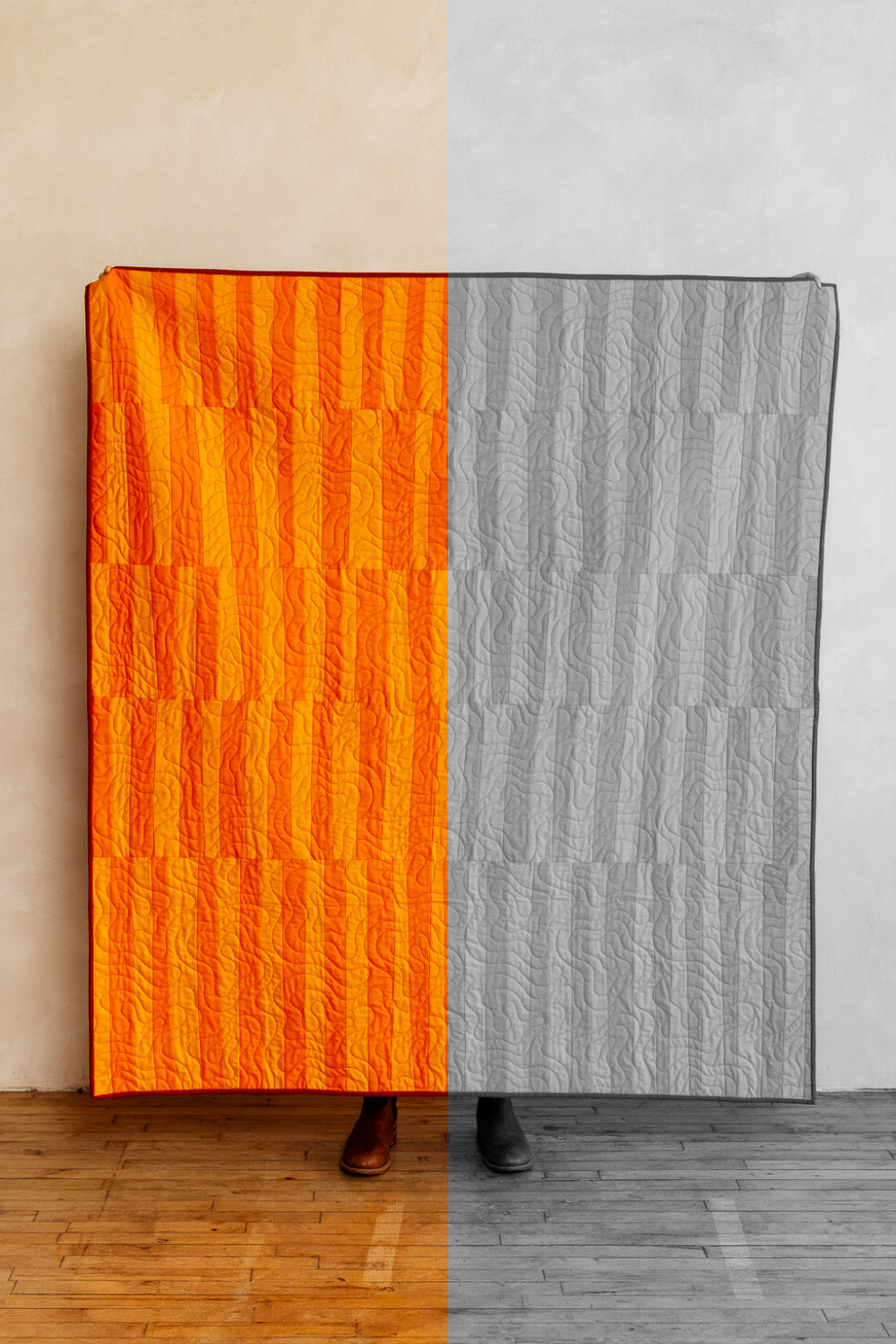
Periodically take photos of your fabric and quilt as you build it and switch the filter to greyscale to check contrast! The contrast here is balanced: not too stark, not too subtle. Shapes emerge clearly, but there’s still a softness to how they interact.
Have one color you love but not sure what to pair it with? Try using a free tool like Adobe Color.
You can plug in your favorite color and explore different combinations—like its complementary color, one of its triadic or split-complementary partners, or even build a soft monochrome palette using two shades of the same hue.
Once you’ve got a pairing in mind, sew up a quick swatch. Make sure the seam between the two fabrics has the kind of visual energy you’re after. It can pop, it can be soft, it can be balanced. Go with what makes your eye happy.
A quick trick: take a photo and switch it to greyscale. It’s an easy way to check contrast:
If the two fabrics blend together in greyscale, your patchwork might end up looking a little muddied.
If one reads almost white and the other nearly black, the seam might feel jarring or overly dramatic.
If the values fall somewhere in the middle, you’ll likely get a more balanced, easy-on-the-eyes effect.
None of these outcomes are right or wrong—it’s all about the feeling you want to create.
If you’re unsure, start with balance. You can always layer in a pop of contrast later to add energy, or muddy the waters on purpose with similar-valued fabrics. But those can be tiny experiments you save for down the road.
Need some inspiration? I’ve been collecting two-color palettes that catch my eye over on Pinterest. Browse the board
Adding in an Accent
I love the soft subtleness this low-contrast quilt brings. But if I was to remake it, I might add in an accent color to add a little visual spice!
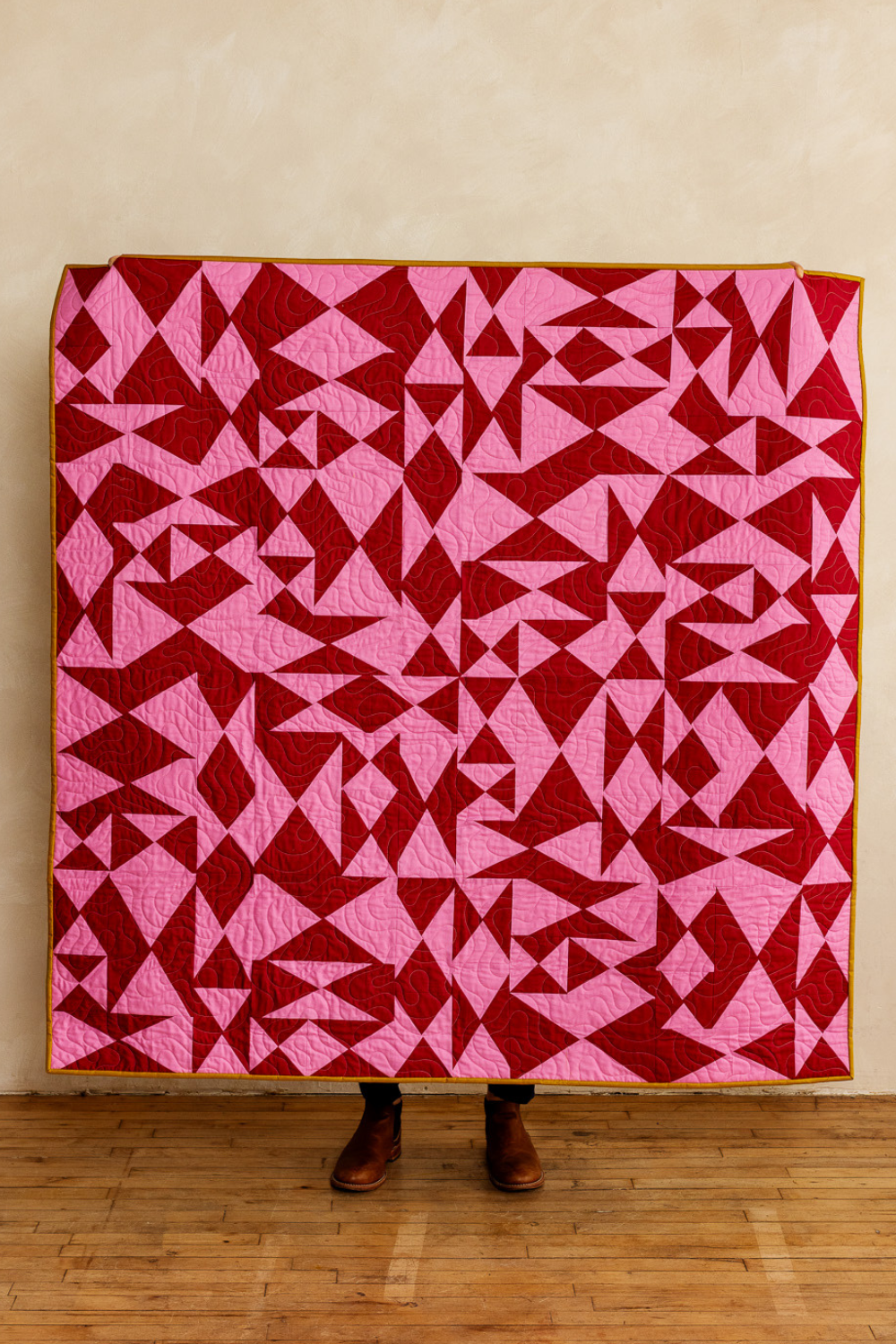
I love two-color quilts. They’ve got such a graphic look to them.
But sometimes, after a few blocks (or at the end!), you might feel like adding a little something extra. When that idea crosses your mind, it’s a great time to introduce a third color as an accent color. A pop of something unexpected can bring contrast, depth, and new momentum.
Not sure what to try? Head back to Adobe Color and plug in your starting color pair. You can then explore complementary, split-complementary, maybe even triadic options to find something that plays well and pushes the palette forward.
And before you commit, try pinning a scrap of the accent around your growing composition to test it out. See what it adds, or what it takes away. Try adding it to a couple blocks. Then slowly introduce it here and there.
Expanding Your Palette

I love how this high-contrast green quilt turned out. And while I kept the patchwork palette simple, I did bring in other color through the binding and backing. Don’t forget those finishing touches are another chance to play with your color palette!
If working with two colors starts to feel too limiting, you can always evolve your palette once you're in the flow. But try not to rush that part. Challenge yourself to begin with a balanced two-color base—it helps build momentum and gives you something concrete to respond to.
Once you’ve made a few blocks, you’re no longer chasing a mental image, you’re reacting to something real. From there, you can start expanding your palette.
Here are a few low-stakes ways to do that:
Add tints and shades of your existing colors (like dusty pink and deep burgundy in a red palette)
Introduce closely related hues for subtle variation
Layer in a neutral—off-white, charcoal, soft gray, or even a pinstripe—to give the eye a place to rest
As always: play. Experiment. Test. Just like when introducing an accent color, audition new fabrics before you commit. Try laying out your blocks on top of a potential new addition. How does it shift the composition? What happens to the overall flow?
No matter what you try, keep finding small ways to shift your perspective:
Step back and squint
Take a photo and flip it to greyscale
Rotate the image (or your blocks!)
Look through your phone’s viewfinder to frame it differently
These simple tricks can help you see your work more clearly—and shape the rhythm and energy of your composition with fresh eyes.
In the End, Let the Fabric Speak
Starting with an intentional palette gives you something to lean on, but it’s not a rigid set of rules.
Color decisions in improv quilting are rarely static. Beginning with two colors provides a flexible framework that can evolve alongside your ideas. When things shift and change, it’s not a mistake, it’s part of the process.
Whatever your starting point, the most important thing is to test, experiment, and audition before you commit. Don’t just imagine how something might look, lay it out. Pin it to the wall. Let it sit for a minute. Give yourself something real to respond to. Not because it has to be perfect, but because it gives you information.
Approach color like an experiment. No judgment. No overthinking. Just observe. Challenge yourself to change your point of view. Notice what draws your eye. What feels off. What surprises you.
Remember: it’s a process, not a destination. Give yourself the room—and the permission—to explore along the way.
Want a Little More Structure?

Follow the Fabric. Trust your instincts.
Chaos Collage is your invitation to let loose. This creative playbook throws out traditional rules in favor of wild, energetic patchwork—and gives you the tools to do it with confidence. It’s not messy; it’s momentum.
Perfect for makers who want to explore bold compositions with a balance of structure and spontaneity, this playbook helps you embrace surprise, scale, and visual tension in a totally unique way.
Why You'll Love It
Intuitive design, big visual payoff: Build bold, high-impact quilts with an easy to follow framework
Guided creative prompts: Tips on contrast, color, and composition help you turn chaos into cohesion
Built for momentum: Skip the templates and sew from the gut
Cut without second-guessing: Freehand cutting video demos walk you through each shape in action
Details
Instant download PDF
Skill level: Advanced Beginner to Easy Intermediate
Standard American terms and measurements
Includes access to companion video tutorials
Includes flexible layout guidance for a Wall Hanging (24” x 30”) or a Crib Size (36” x 48”) quilt
© 2025 Broadcloth Studio. All Rights reserved. Resell of finished product with pattern credit allowed.
And if you’re ready to explore bold compositions with a limited palette—whether you’re working with two colors, adding a subtle accent, or playing with proportion—the Chaos Collage Playbook is a great next step.
It’s packed with prompts, cutting demos, and layout ideas to help you build energetic, high-impact quilts with just enough structure to keep things flowing. Whether you’re chasing rhythm, contrast, or surprise, this playbook helps you experiment with confidence.
No templates. No pressure. Just fabric, instinct, and momentum.
You May Also Enjoy These Quilting Tips and Guides: